Welcome back to Digital Art 101!
An ongoing series seeking to answer the most common distributor and end-client questions.
Last time, we discussed the difference between Vector and Raster and how to identify them.
Today, we will go over how to check the art and determine if it is suitable for production. We will be using the Adobe suite programs: Illustrator and Photoshop.
Vector Art: How to prepare for production
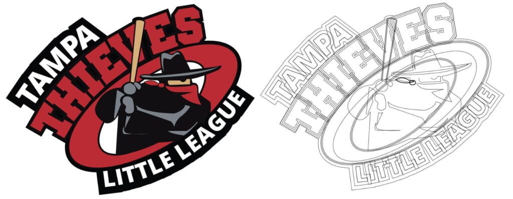
To check if your vector artwork is suitable for production, it is always important to open it up in your vector program and view it under outline mode. You can navigate to the VIEW drop-down menu and choose outlines, or select Command+Y (Mac) or Control+Y (PC) to activate it.

However, vector art can sometimes have two common issues which need to be remedied before going to production.
These issues are missing or un-outlined fonts, and/or un-embedded links.
Vector Error: Fonts Missing
Font issues arise when the art still has EDITABLE TEXT, and your personal computer doesn’t have that font in the system. When opening it in Illustrator, you should receive a MISSING FONT ERROR dialog box, and the missing font will be highlighted in pink. In this scenario, it is best to ask the customer to have all text outlined and resubmit the art. Even if the replaced font looks close, the font can be subtly different in a way that is not immediately noticeable.

Sometimes, the font will not be replaced, but the text will show as black text in outline mode (Second example). This means the text is not outlined, but the system was able to find the font. Be extra careful when reviewing and comparing the font to a PDF preview of the art. At this stage, you can select all the replaced fonts and go to the menu and choose TYPE>CREATE OUTLINES. When completed, your font will look like the third example and will be safe to send for production.
Vector Error: Un-Embedded Links
Missing links are becoming an increasingly common issue for vector artwork due to graphic design teams sharing projects and files with each other. By linking a file, the file object will update every time the source image updates in a linked folder. However, when preparing for pre-production, these objects need to be EMBEDDED to ensure they will travel with the file.
When opening a file with an un-embedded link you will receive an error message dialog box warning you of the missing object. Clicking REPLACE will allow you to find the file if you have access to it while choosing IGNORE will allow you to open the file.


Missing links will not show in VIEW MODE. So If you are unsure of what is missing when you fully open the file, viewing in outline mode will reveal a shape with an X through it. When this happens, please ask your customer to provide artwork with all links embedded.
Raster Art: How to prepare for production
When it comes to raster art it is very important to make sure the files meet minimum print quality requirements for your Full color, CMYK, or Digital Print products. This minimum quality is 300 DPI or Dots per inch at inset size.
You will often see terms like DPI, PPI, and Resolution when discussing Raster images, but they all basically mean the same thing. The number of pixels or dots in a single square inch.
For this section, we are going to pretend we are producing a full-color 4” sticker, which means we need art that is at least 4” and 300 DPI or resolution. This process is actually quite simple.

Checking art print quality for 4″ sticker
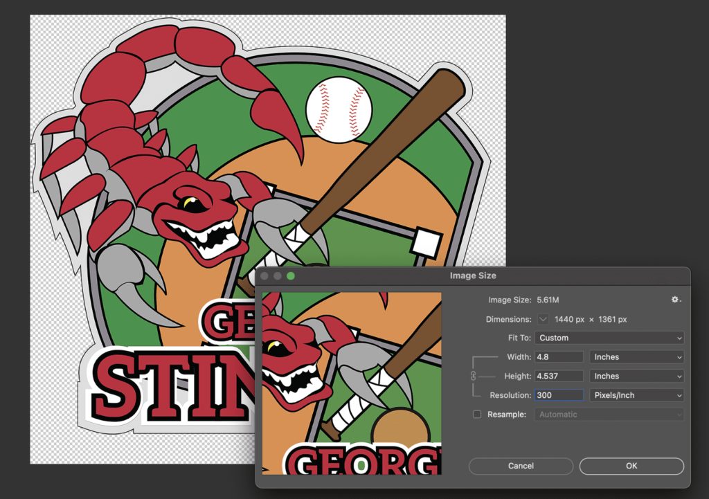
- Open art in Photoshop.
- Navigate to the menu to IMAGE > IMAGE SIZE.
- Check to make sure the resolution is 300 or above.
- Confirm width and height is appropriate for the inset size of your imprint area. This area often defaults to pixel sizes, just click the dropdown area and choose inches.
Have high-quality artwork that has a large width and height but a low resolution of 72 dpi? If the image is three times larger than you need for the inset width and height, worry not! You can send that artwork in and we can move some pixels around!
Thank you for sticking around for lesson three of our Digital Art Series,
stay tuned for our Blog on “Differences in Color.”


Leave a Reply
You must be logged in to post a comment.