Welcome back to Digital Art 101, an ongoing series seeking to answer the most common distributor and end-client questions, and today we are discussing colors and how it affects your final product. Below are the previous lessons we have tackled.
Color in reference to print and design exists in several different forms, but the most common gamuts or color ranges are RGB, CMYK, and PMS (SPOT) color.
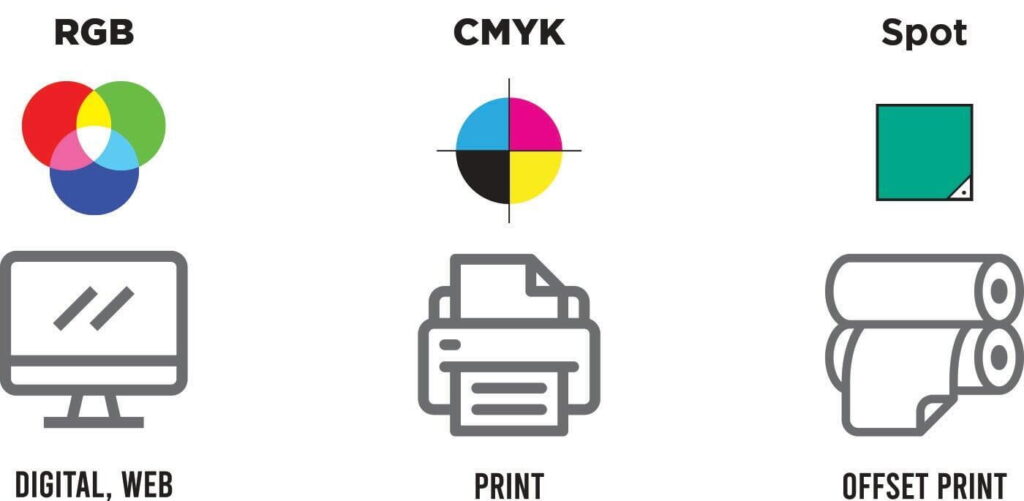
RGB Color Range
RGB color is the color of lighted screens and the most diverse of the design color gamuts, able to display nearly 16 million colors due to its combination of colored lights of RED, BLUE, and Green. Despite their range, no two screens are the same and are highly variable. Keep this in mind when discussing colors in a proof, because what may look right to you can look quite different on a higher or lower-quality screen.
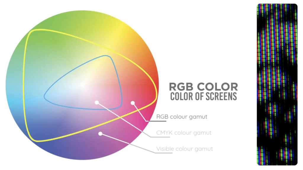
Since customers can see colors as bright and vibrant on their screens, they often have questions as to why their proofs may look dull or off in comparison. RGB is able to display colors that are simply not always achievable for a CMYK process. Because of this, we make proofs in the CMYK color profile to show these limits.
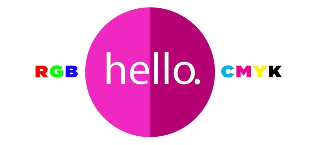
CMYK Color Range
CMYK refers to the color process in which the four colors cyan, Magenta, Yellow, and Black are combined together to make full-color imprints. Because there is no light behind these colors when printed on a surface, the color range for CMYK seems quite dull and limited when compared to RGB, especially for neon colors, dark blues, or dark blacks.
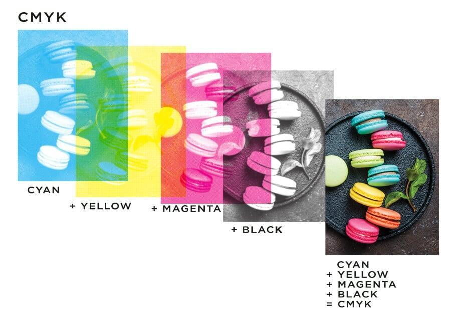
Throughout these lessons, you have heard me use the terms CMYK, Four Color Imprint, Offset Printed, and Digital Print rather interchangeably. But they all mean the same thing when it comes to the final product. This process is used for products like our lip balms, offset-printed lapel pins, stickers, buttons, and dye-sublimated lanyards.
PMS (Pantone Matching System)
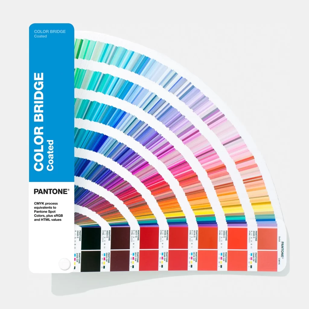
When discussing colors, get used to using your PMS book. Screens can be variable, but a PMS color book is the same no matter where you are in the world. A PMS book is the easiest way to communicate colors with a client, especially for products like embroidered patches. At IDProductsource, we primarily use the Solid Coated PMS Book, but it is possible to request neon or metallic colors for certain products or imprints.
In the photo on the left, you can see an example of a Color Bridge PMS book, which is handy to show a PMS color and its CMYK equivalent color on the right column.
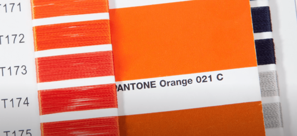
PMS stands for Pantone Matching System and is a standard color system in print shops and factories. We use PMS color for any products that use color-fill’s, woven patches, silicone, PVC, and have silk-screened imprints.
Customers will sometimes ask you to PMS color match for CMYK or embroidered products,
and while we take great care to find the closest color equivalents we can’t always guarantee a match.
So that’s it! You have completed our Art Lesson Series.
Have more questions about art for us?
Leave us a comment!


Leave a Reply
You must be logged in to post a comment.